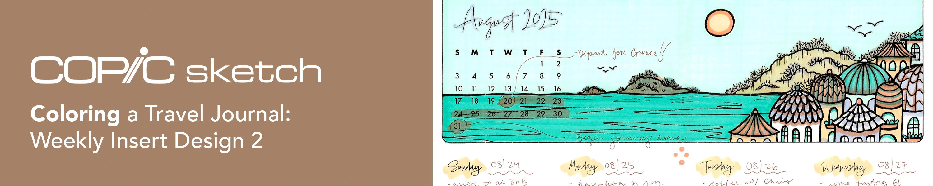
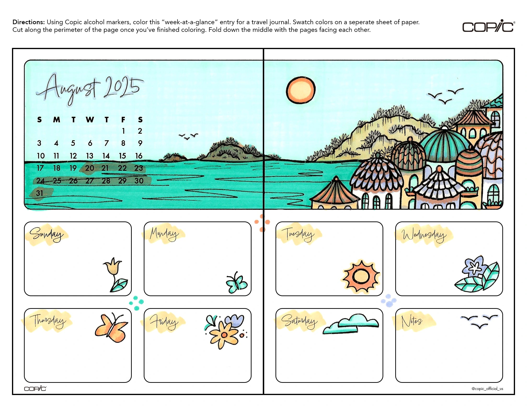
こんにちわ Copic readers! In our previous blog, we stepped inside our travel journals to color a week-ahead insert using a vertical format, where the main illustration and calendar was on the left side and the weekday notes were entirely on the right. In today’s blog, we’ll be coloring another week-ahead insert where all of the content is spread across both pages. We’ll be using the Sketch Pale Pastels 6pc set and a Sepia 0.3 Multiliner pen to show how to color this spread. And with that, let’s take a look at the two templates below and get started!
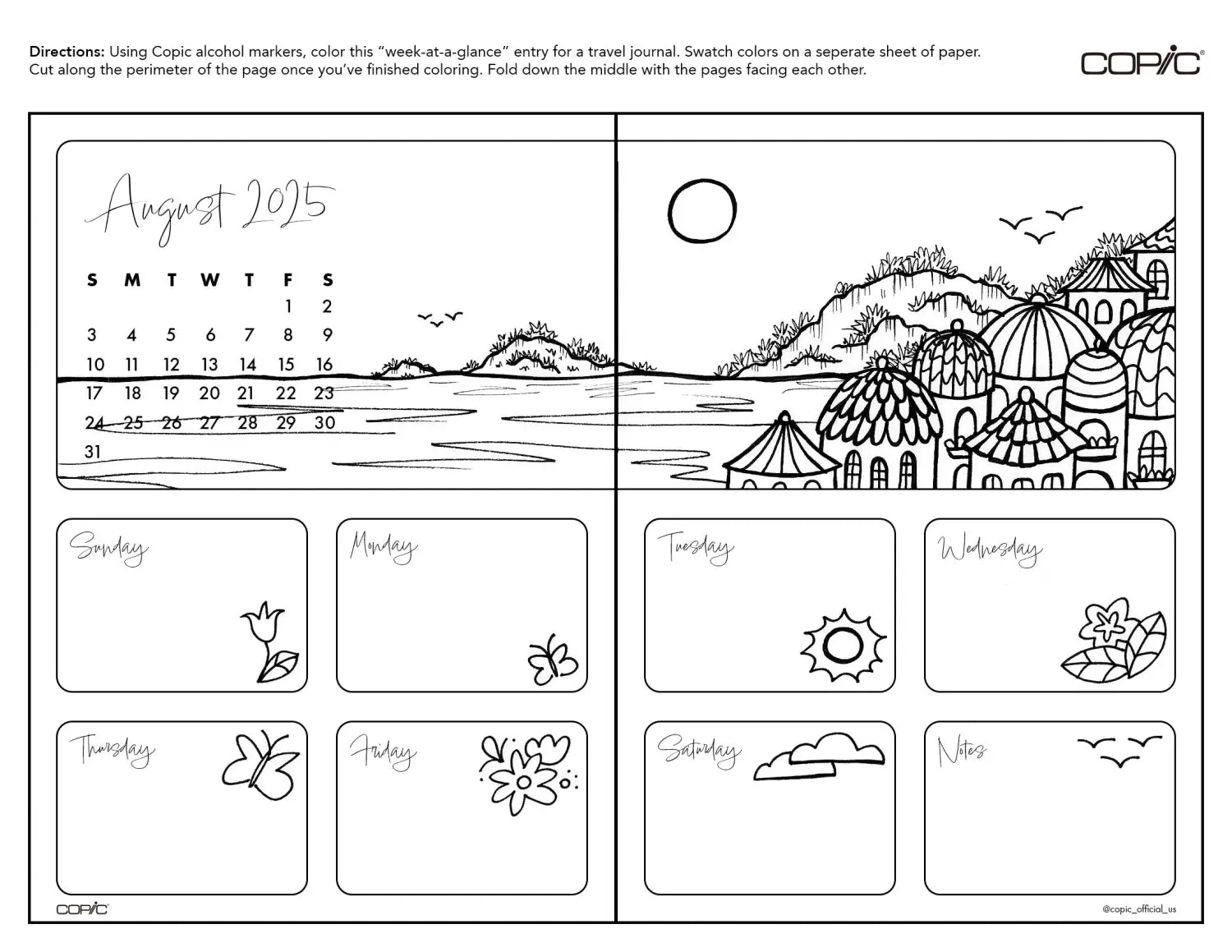
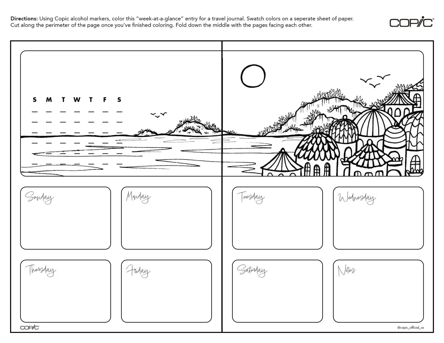
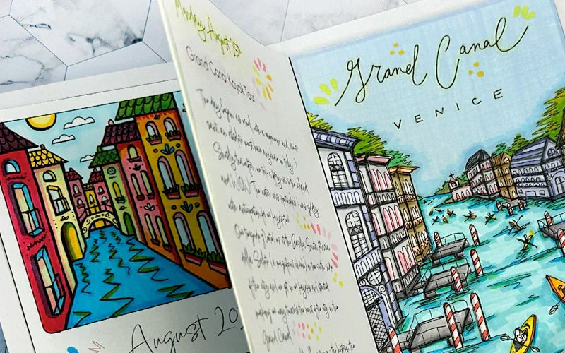
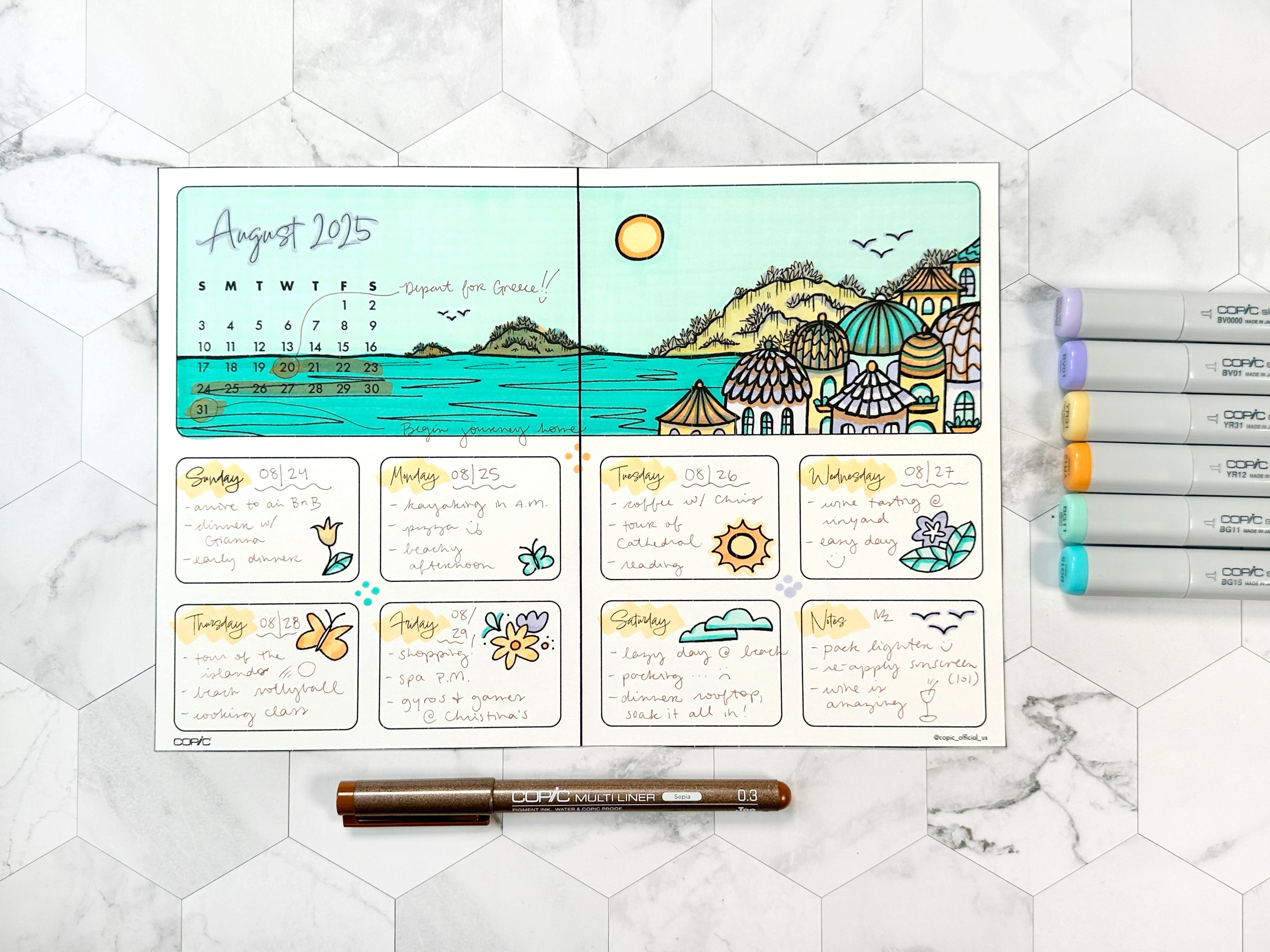
For today’s blog, we’ll be using the template on the top for a fictional trip to Greece using the month of August 2025 as the time the trip took place. If, however, you’d like to fill in this template with details of your own tropical vacation, we’ve included a blank template above. Both of these templates can be downloaded here in our line art gallery.
To begin coloring, the artist chose to start with the largest areas first, using BG11 for the sky and BG15 for the water. Turning the page vertically, the artist used the side of the Super Brush nib to color in long, horizontal lines, working relatively quickly and maintaining a steady pace to ensure the entire area is colored evenly (so that none of the marker ink is pooling in one spot). The artist used the same technique to apply BG15 for the water.
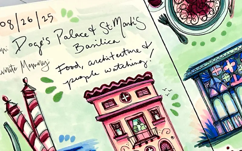
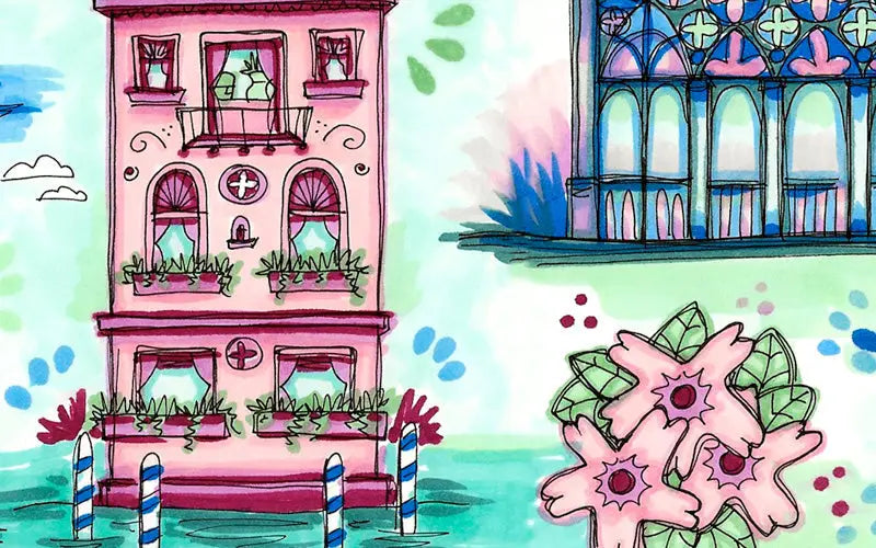
Next, the artist uses YR31 and YR12 to color the suns, flowers, and some of the coastal buildings. The artist then goes back to BG15 to color the distant islands and layers them with YR12 to create a dark, mossy earth-tone color. For the islands closer to the foreground, the artist repeats this process using BG11 followed by a layer of YR31. This combination creates a lighter mossy color.
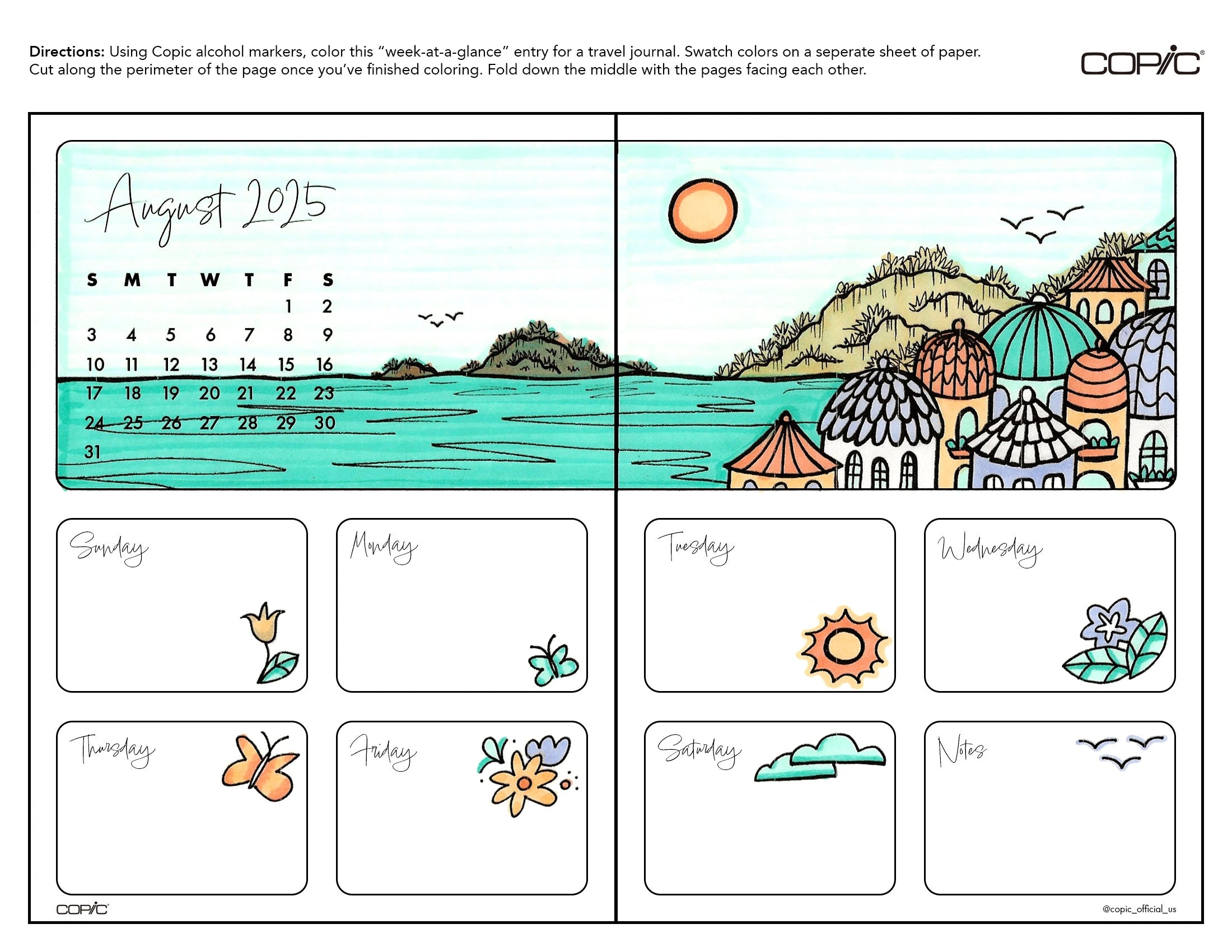
The artist then uses the very pale BV0000 (the lightest of the blue-violet colors) and BV01 to color the remaining coastal buildings in the foreground. These light blue-violets are also added to some of the doodles below. Finally, to wrap up the first layer of coloring, the artist goes back to using BG11, BG15, YR12 and YR31 to make sure all areas of the illustration (and the doodles beneath) are filled in with color.
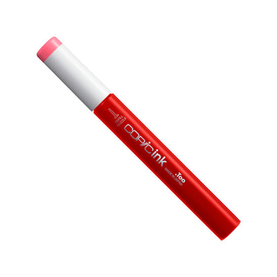
Before we continue by adding more layers of color, let’s take a look at how to refill a Copic marker. The artist noticed that the BG11 nib was starting to turn white/the nib was no longer as saturated with color. So, the artist got the corresponding BG11 Copic Ink color out and refilled it before moving forward. This process only takes a few minutes (as seen in the short video above) and makes a big difference in the quality of your coloring!
After refilling BG11 and letting it lay flat on the table for a few minutes so the ink could evenly distribute to both sides of the marker, the artist began to add more layers of the darker colors inside the Sketch Pale Pastels set, beginning with another layer of BG11 for the sky. The artist chose to color in the opposite direction for this second layer, using the same Super Brush nib to add pigment and move left to right across the page.
After this layer, the artist grabs BV01 and begins using it to outline the month of August and to layer it again within the islands in the background and the cityscape in the foreground. Layering BV01 with either the YR or BG colors produces a muted earthy color, proving effective for landscape illustrations!
Next, the artist uses YR12 and BG15 throughout the foreground to add depth to the buildings and the water. Finally, the artist uses YR31 to highlight the days of the week below, allowing them to stand out before adding notes and memories to each of the eight spaces.
Once all of your marker coloring has been completed to your satisfaction, it’s time to add notes and other doodles to the template. Similar to our last blog, the artist adds notes from the trip using a Sepia 0.3 Multiliner pen. The artist chose to use Sepia to stand out against the black linework throughout the entire template and to add a more personal touch.
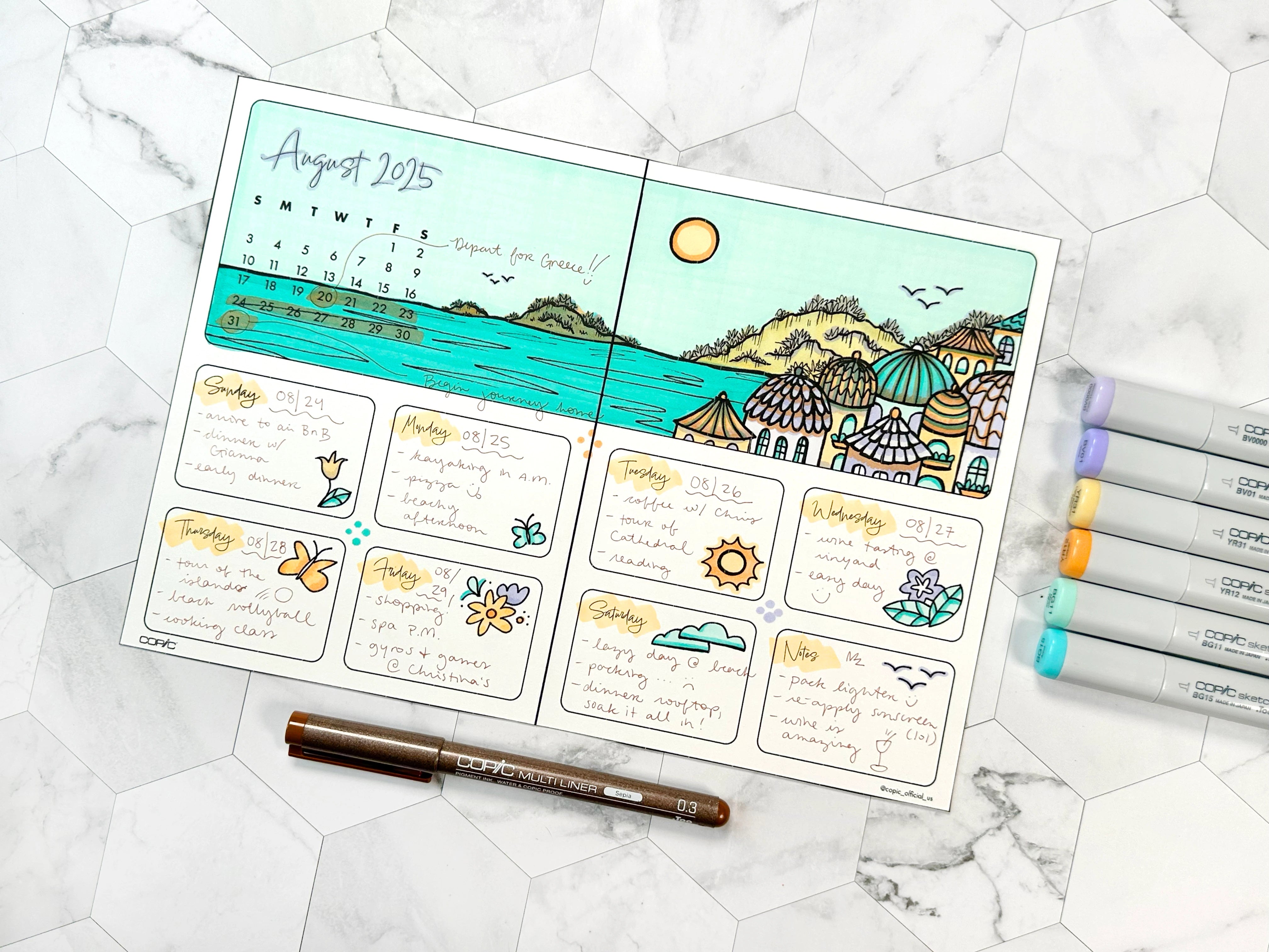
After all of the notes have been added, it’s time to cut out the template and fold the two halves inward so they’re facing one another (as seen in lightning speed at the end of the timelapse video above!). If you’ve been following along with our previous blogs, this insert goes inside one of the travel journal covers. In the video above, the artist chose to pair this insert with the General cover, colored in our blog here.
And with that, we wrap up today’s blog! To give this lesson a try yourself, download the above template here from our line art gallery and print it on a sheet of smooth cardstock suitable for Copic alcohol markers. If you’re wondering what kind of paper works well with a home printer and can also handle multiple layers of coloring with Copic markers, we recommend using Neenah Bright White Premium Cardstock 65 lb. paper, which the artist used in this blog. Then, using the Sketch Pale Pastels 6pc set (or any other set of your liking), color the illustrations and fill in the dates with a trip you already took or a fictional trip you’d like to take someday.
If you’d like a blank version of this template mentioned at the beginning of this blog, you can find that here in our line art gallery.
In our next blog, we’ll be showing you another way you can layout and color a weekly insert design for your travel journal using the Sketch 6pc Pale Pastels set. Until then, don’t forget to follow us across our social media channels @copic_official_us, and sign up for exclusive discounts and prizes by joining the Copic Club! One last thing - use #copicwithus or tag us @copic_official_us for a chance to have your drawings or workspace featured on our Copic US social media channels.
Thank you so much for reading and enjoying Copic markers as much as we do! 😀