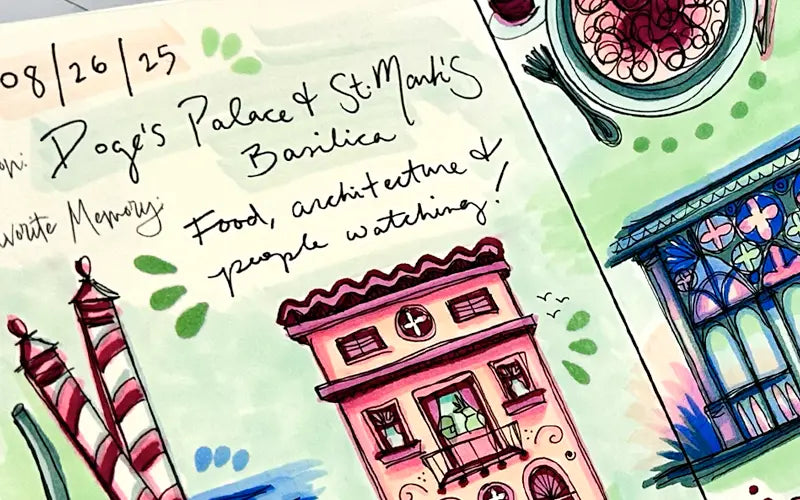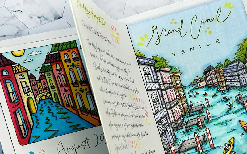
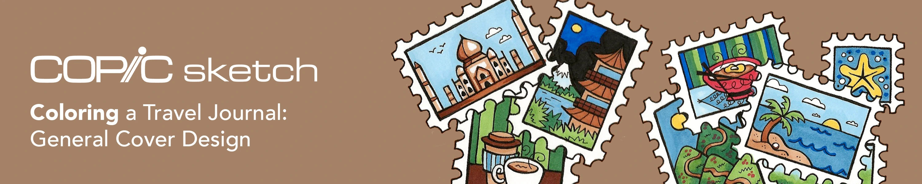
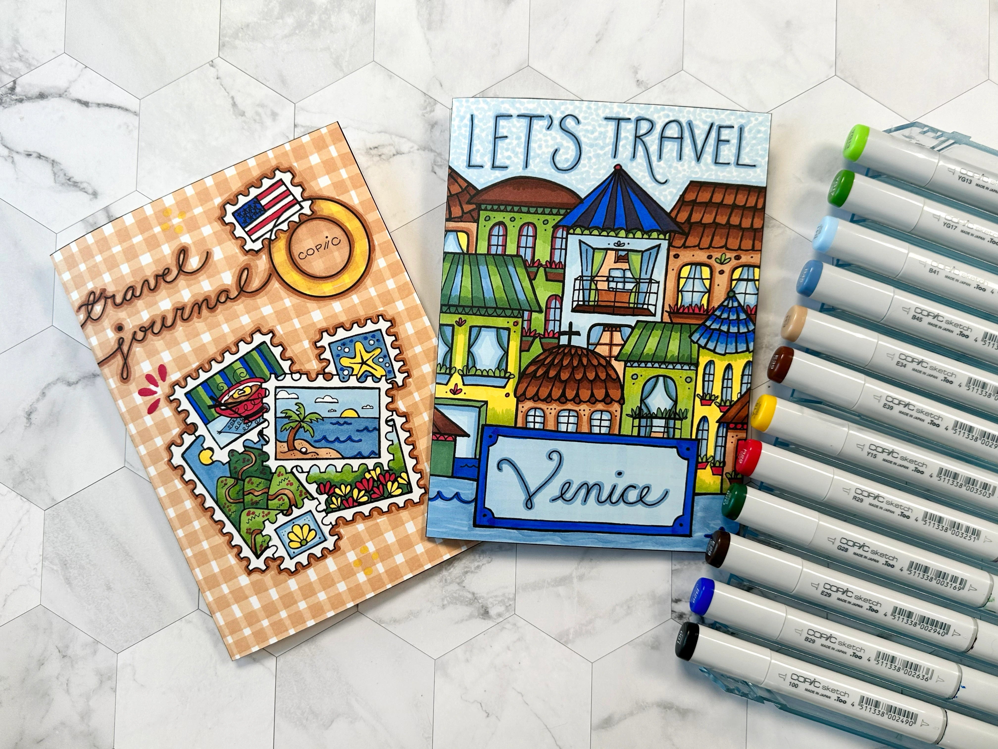
こんにちは Copic readers! In our previous blog, we colored our first travel journal cover design for a trip to Venice, Italy using the Sketch Earth Essentials and Bold Primaries 6pc sets. In today’s blog, we’ll be showing how to color a general travel journal cover design using the same two marker sets (these colors are very versatile, especially for nature scenes!). And with that, let’s take a look at the template below and get started!
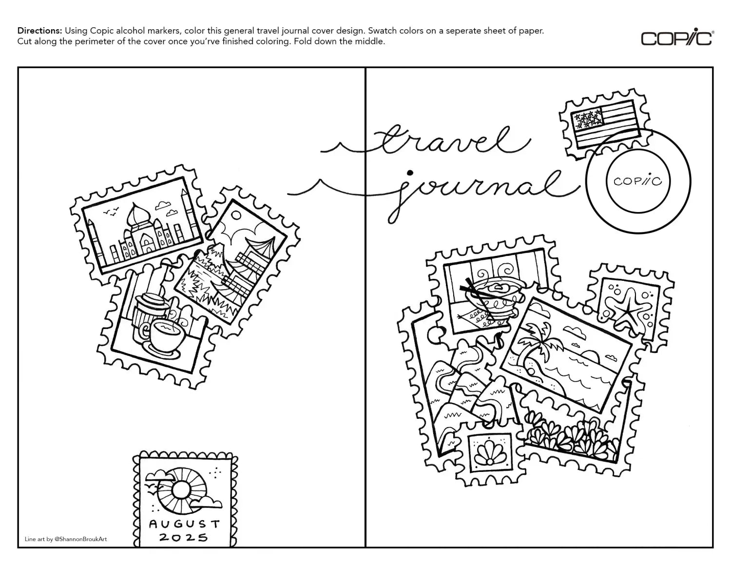
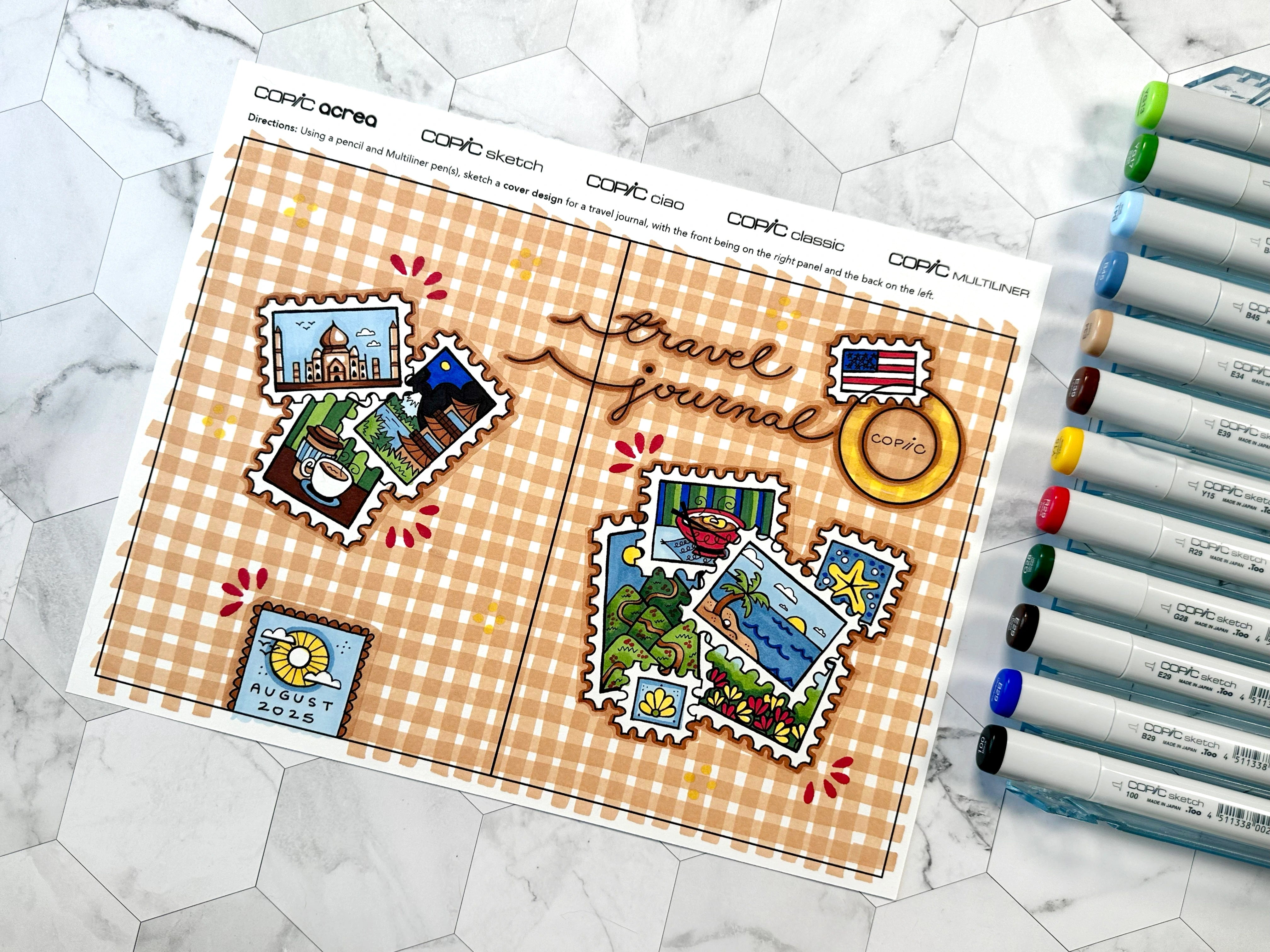
If you've been following along with this blog series, you’ll remember that back in July, we shared a step-by-step guide on how to design and draw two different travel journal covers. The above template is the final drawing of the general travel/stamps design, where the artist wanted to be able to use this cover for any of their trips – or for multiple trips! While the black and white drawing does look nice, it’s time to add some color and personality to this cover!
Using the Medium Broad nib of the E34 Sketch marker, the artist began coloring the background holding the nib flat on its longest side to create broad vertical lines across the entire cover. The artist then “eyeballed” each line and spacing, so the measurements between each line of E34 aren't exactly even, nor are they drawn completely straight. However, what the artist did do for each line is create it in a single pass, without lifting up the marker or stopping. This is why each line of E34 looks so smooth and colored evenly!
The artist then repeated this step using the Medium Broad nib going horizontally across the entire cover too, creating a picnic plain pattern. Notice how the artist left some white space around the border of each cluster of stamps. These patches of non-colored space will be filled in using the Super Brush nib in a future step!
The next step is the fun part, adding color to the stamps! Beginning with B41 and B45 from the Earth Essentials set, the artist uses these two blues to color the skies of each stamp that has an outdoor scene depicted. The artist then uses E34 and E39 to add earth-tones to the coffee, the Taj Mahal, the Japanese temple, and the beach and hillside scenes. Next up, the artist uses Y15 and G29 from the Bold Primaries set, again filling in color to the stamps that show an outdoor scene.
The artist continues coloring by adding YG17 and YG13 from the Earth Essentials set, as well as 100 Black, E29, R29 and B29 from the Bold Primaries set. Every color from both of these 6 pc sets was used in coloring this cover!
The final step in coloring the cover is to add layers, soften the color blends and create contrast. The artist begins by outlining the stamp clusters again with the Super Brush nib of E34. The artist then goes over each stamp cluster with E39, adding more contrast between them and the plaid background. The artist also chooses to outline the cursive “travel journal” with E39 so these words don’t get lost in the background.
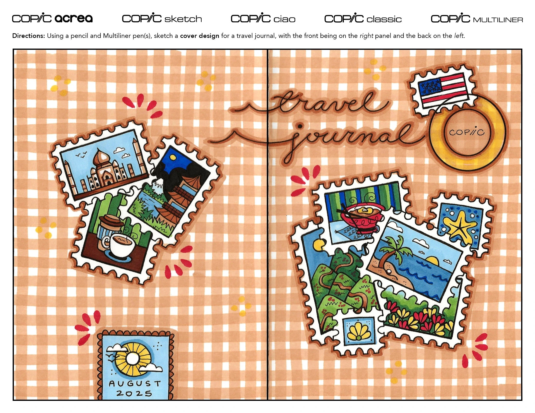
The final step is adding some fun, small details using the side of the Super Brush nib to create a petal-like shape. The artist accomplishes this by laying the marker almost flat against the paper, capturing the tip of the marker and up to where the nib reaches the marker body. Touch the nib to the paper quickly to ensure the ink doesn’t spread too fast and cause the ink to pool on the page. The artist here chose to use 4 petals as a corner accent, but you can repeat this technique as many times as you see fit.
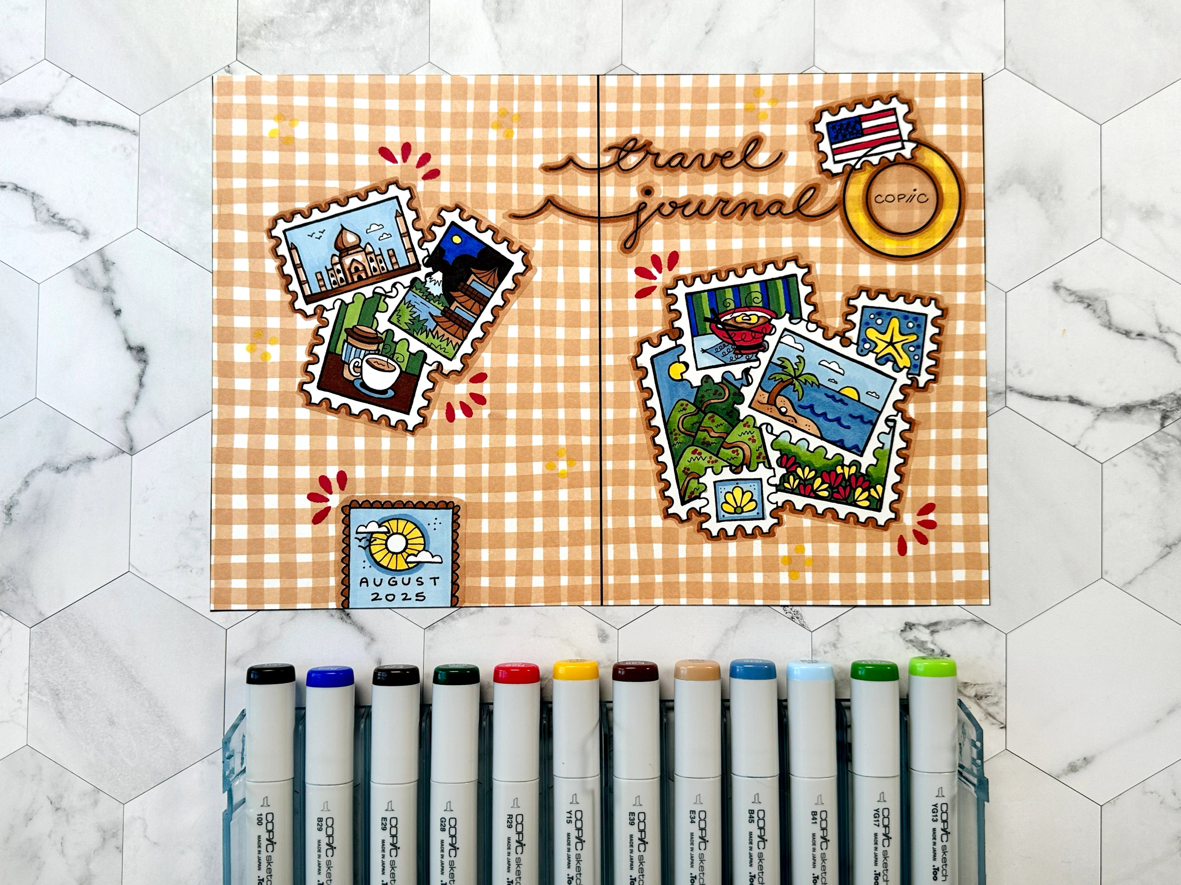
The last thing the artist does to complete this cover is use Y15 to add some subtle small dots on the front and back, as well as highlight the Copic circle at the top right corner of the front. Any additional shading or patterns can be added, but be aware of over-crowding your design - you want a place for your eye to rest and for the focal point to stand out!
Last but not least, it’s time to cut out the cover and fold it down the middle! Since this entire cover was colored using Sketch alcohol markers, the ink will be seen on the backside of the paper, but notice that it did not bleed through onto the artist’s desk. This is thanks to the paper the artist chose, Neenah Bright White Premium Cardstock 65 lb. paper. This mid-weight paper is perfect for Copic alcohol markers; the colors blend well together, it allows for multiple layers in one area and it can also handle Copic acrea and Multiliner pens effortlessly. This paper can also run through a home printer with ease and it’s thin enough to fold in half evenly. This simple cardstock is a workhorse and we recommend it for illustrators, crafters, cardmakers, designers, and anyone using Copic products!
And with that, we wrap up today’s blog! To give this lesson a try yourself, download the above template here from our line art gallery and print it on a sheet of smooth cardstock suitable for Copic alcohol markers. As previously mentioned, we recommend Neenah Bright White Premium Cardstock 65 lb. paper, which was used in this blog. Another great paper for coloring with Copic markers is the Premium Bond paper found in all Copic Sketchbooks! Then, using the Earth Essentials and Bold Primaries sets, or any other Sketch sets you would like, color the cover!
In our next blog, we’ll be showing you how to color a weekly insert design for your travel journal using the Sketch 6pc Perfect Primaries set. Until then, don’t forget to follow us across our social media channels @copic_official_us, and sign up for exclusive discounts and prizes by joining the Copic Club! One last thing - use #copicwithus or tag us @copic_official_us for a chance to have your drawings or workspace featured on our Copic US social media channels.
Thank you so much for reading and enjoying Copic markers as much as we do! 😀