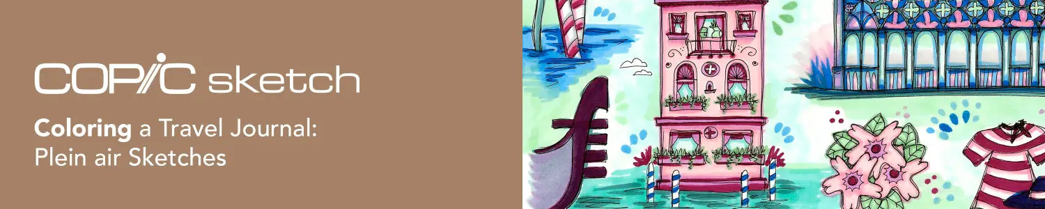
Howdy Copic readers! In our previous blog, we colored a very detailed travel destination, the Ponte di Rialto, using the Sketch Manga Illustrations 24 pc set. Today, we’ll be showing you how to color plein air sketches using the Sketch Sea & Sky and Floral Favorites One 6 pc sets. And with that, let’s take a look at the template below and get started!
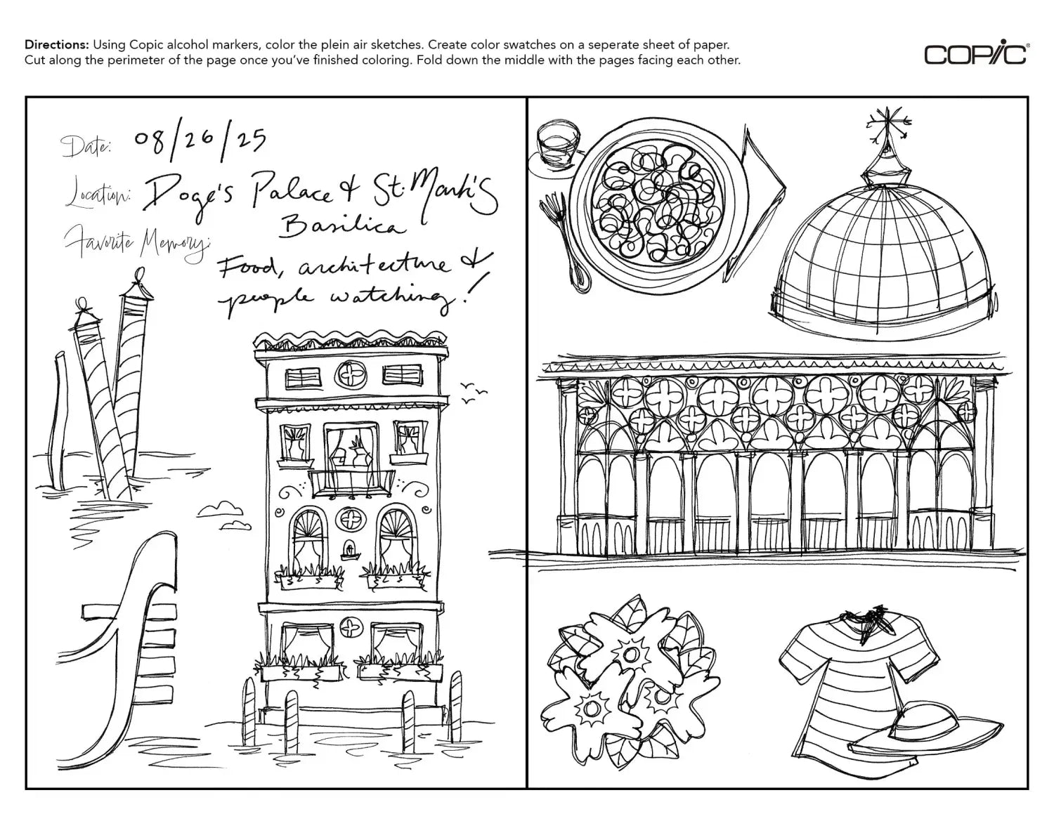
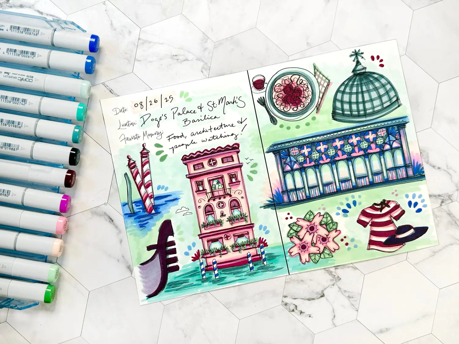
If you've been following along with us in our travel journal blog series, you’ll know that we’ve drawn and colored two different cover designs, two different weekly inserts, two different featured destinations, but only one plein air sketch spread. Why only show one example of plein air sketching when every other component has seen two options? When it comes to plein air sketching, it’s very personal, almost like keeping a visual diary, so each plein air sketch “entry” is very unique. Some consist of only one drawing with many small doodles while others have numerous small doodles and no notes at all. The one example we have today is a general layout of small drawings with many different proportions and levels of detail in hopes to show a variety of character and examples for what your own plein air sketches can look like, keeping written notes to a minimum and line variation at a maximum! With that in mind, let’s take a look at the video below and get started coloring!
Using only the 12 colors included in the Sketch Sea & Sky and Floral Favorites One sets, the artist uses some unconventional color combinations and layering to create additional colors for this otherwise heavy pink, blue-green and blue palette. Bouncing back and forth between colors quickly, the artist begins by using RV13 and RV69 to color the candy-cane water buoys on the left. Using BG72 and BG78 for the additional limb in the water, the artist uses at least two layers of the very blue B24 for the water.
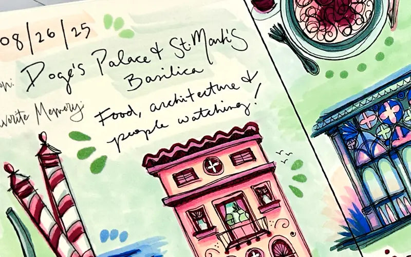
Next, the artist moves on to the largest vertical drawing in the spread, the Venetian building, by covering the entire structure with R01, followed quickly by RV13 and V05 for some mid-tone details in the windows, balconies and roofline. RV69 is then added for stark contrast, followed by BG10, BG13 and BG78 for contrast against all the pink in the building (and for the water). YG45 and YG41 are quickly used to color the leaves on the flowers next to the building (the artist is not only changing which marker colors they're using quickly, but also the subject they’re adding color to!), followed by more layers on the building and B28 added to the water nearby.
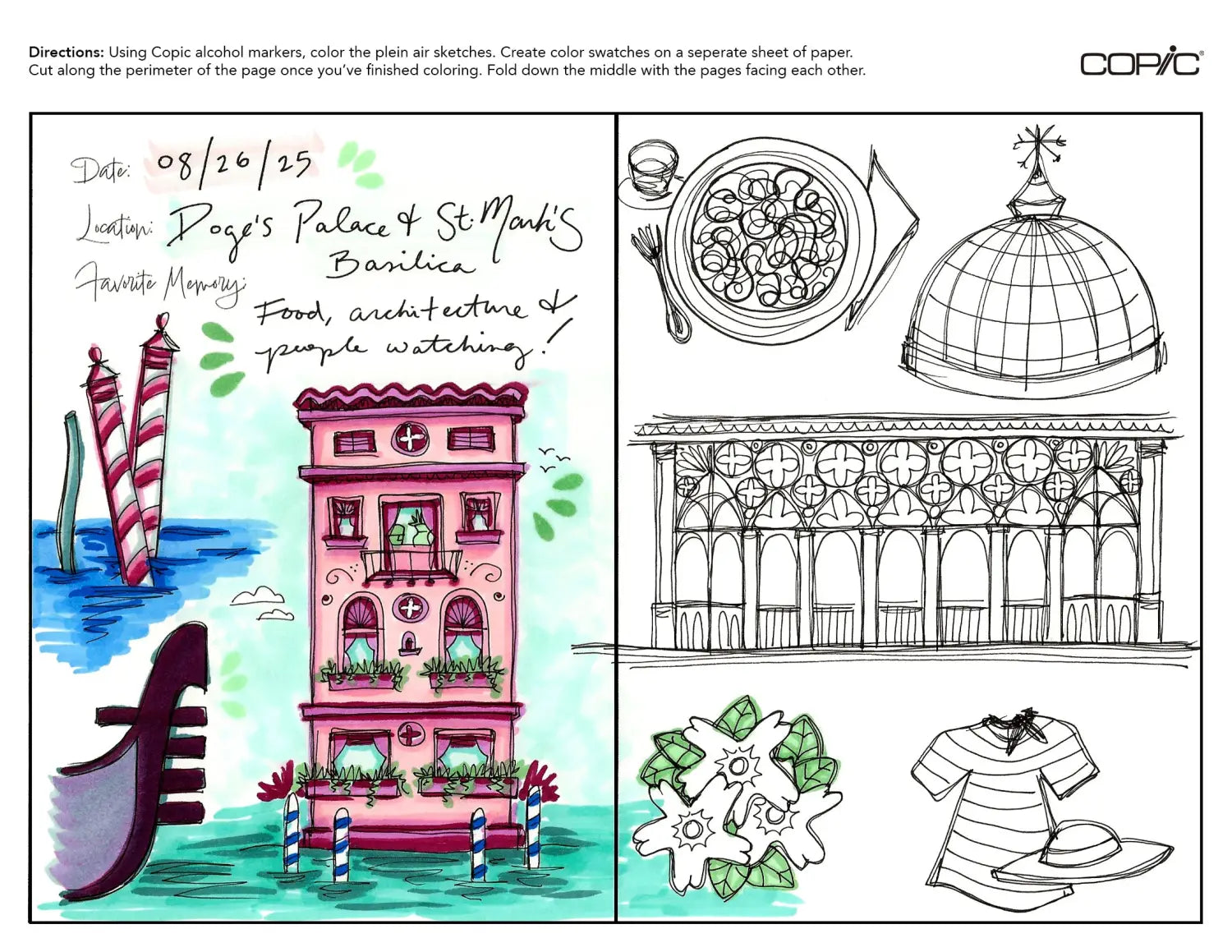
To wrap up the left side of the spread, the artist layers BG78 with RV69 for the outside of the gondola, while layering V05 with BG72 for the inside. Finally, the Super Brush nib of BG10 is used loosely to scribble in the sky, while YG45 is used to add petal/expressive marks beside the tall building.
Moving on to the right side of the spread, the artist begins by adding color to the flowers and the striped t-shirt and hat in the lower half of the page. Using light and mid-tone pinks for the flowers, the artist uses the very dark RV69 for the striped shirt and hat for contrast. Then, following a similar layering formula as the gondola in the lower left, the artist used B28 to produce an almost black hat. Using the same technique as the left half of the spread, the artist holds the Super Brush nib at an angle to make groups of dots and petal marks to unite both sides of the spread.
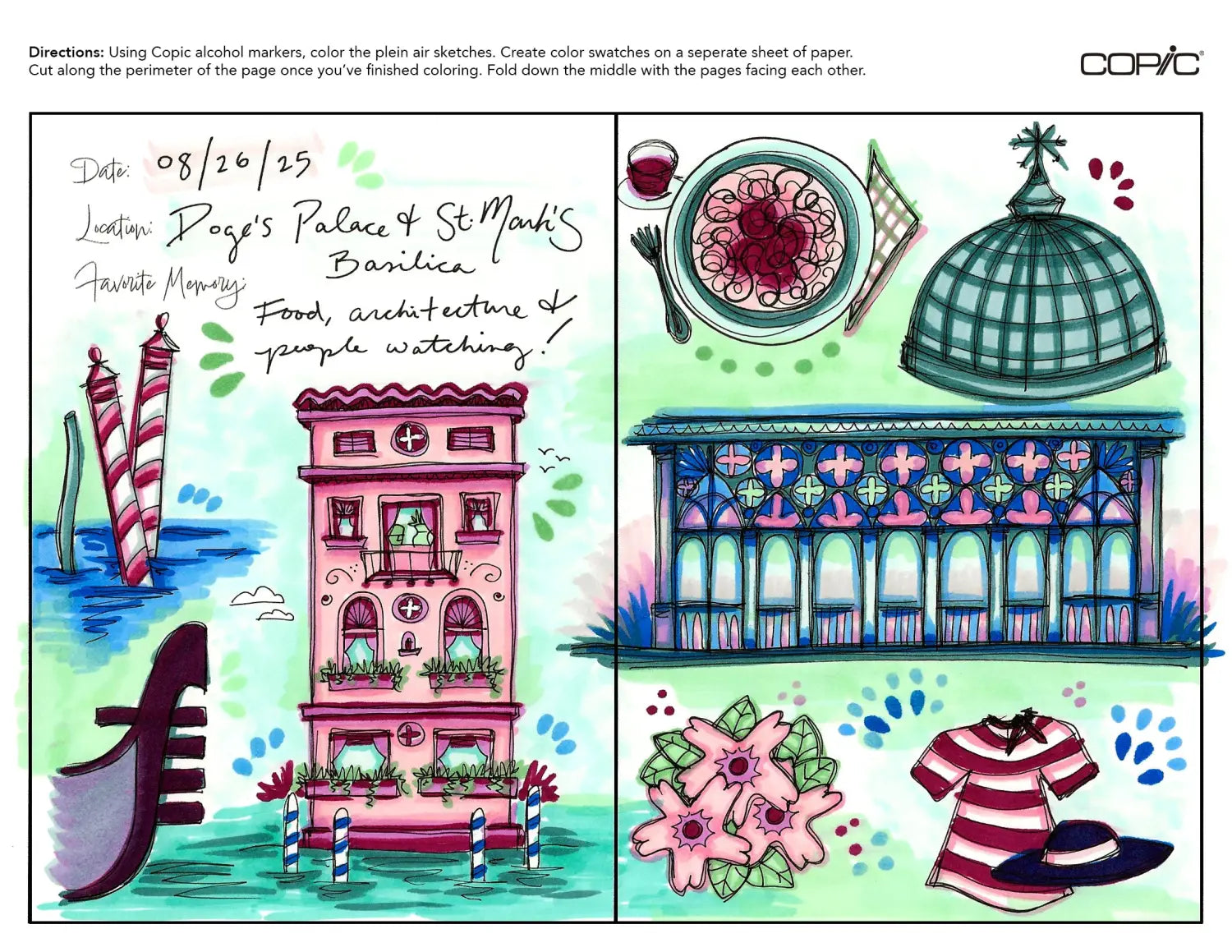
Next, the artist uses BG78 to begin coloring the detailed horizontal terrace. Since the artist chose to color the vertical building in warm pinks, they decided to use blues and blue-greens for a cool contrast. Using BG10 and YG41 to create a background color, the colors B24 and B28 are used next for shadows. The mid-tones V05, RV13 and the pale R01 are used for the details of the terrace, adding a pop of warmth to the top and sides of this sketch.
To complete the remaining sketches on the page, the artist uses the simple pairing of BG78 with BG72 for the dome and the fork and plate for the spaghetti dish. Returning to the warm pinks, the artist uses R01, RV13 and V05 for the pasta and sauce, followed by RV69 for the meatballs and glass of wine. A simple checkered napkin and a few dots made beneath the plate with YG45 complete this last sketch.
To wrap up this spread, use a pair of scissors and cut the perimeter of the template. Then, fold the page “hamburger style” down the middle. If you haven't turned your page around yet, this is a fun time to do so and see where all your marker layers have added up the most. Next, grab your colored travel journal cover and weekly insert (the artist used the general cover design with the horizontal weekly spread and the Ponte di Rialto destination) and add this plein air spread to the back of the journal.
Notice how the pages don’t fit exactly flush with the border of the cover. This issue will be addressed in the next blog where we will show how to “bind”/assemble all of the interior pages to the cover.
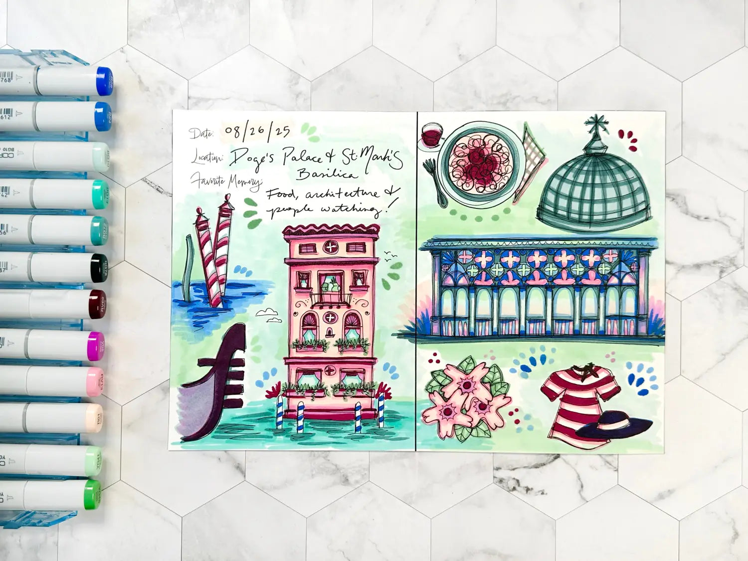
And with that, we wrap up today’s blog! To give this lesson a try yourself, download the below template here from our line art gallery and print it on a sheet of smooth cardstock suitable for Copic alcohol markers. If you’re wondering what kind of paper works well with a home printer and can also handle multiple layers of coloring with Copic markers, we recommend using Neenah Bright White Premium Cardstock 65 lb. paper, which the artist used in this blog. Then, using the Sketch Sea & Sky and Floral Favorites One 6 pc sets (or any other set(s) of your liking), color these plein air sketches and experiment with bold color combinations!
In our next blog, we’ll be showing you how to assemble the Venetian travel journal using two inserts. Until then, don’t forget to follow us across our social media channels @copic_official_us, and sign up for exclusive discounts and prizes by joining the Copic Club! One last thing - use #copicwithus or tag us @copic_official_us for a chance to have your drawings or workspace featured on our Copic US social media channels.
Thank you so much for reading and enjoying Copic markers as much as we do! 😀