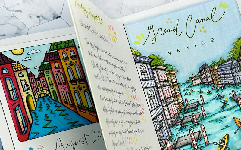

Greetings Copic readers! In our previous blog, we started showing how to color the first of our featured travel destinations, the Grand Canal in Venice, Italy, using the Sketch Manga Illustrations 24 pc set. Today, we’ll be showing you how to color the second detailed illustration, featuring the Ponte di Rialto (also located in Venice) using the same Sketch Manga Illustrations 24 pc set colors. And with that, let’s take a look at the template below and get started!
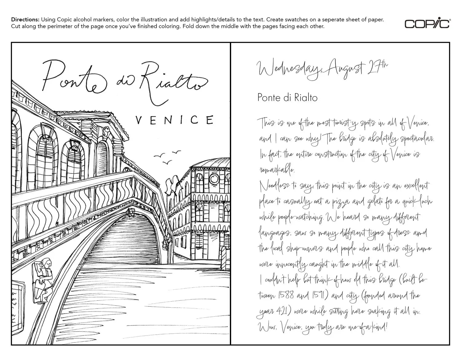
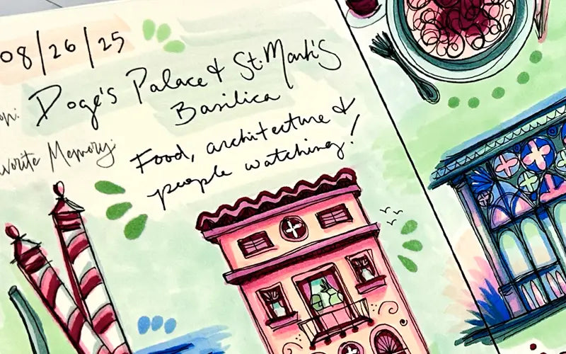
If you've been following along with us in this travel journal blog series, you’ll remember how we sketched two different travel destinations back in August. Both of these drawings were very detailed and required the highest level of skill compared to the other travel journal components we've been making (the covers, weekly inserts, etc.). With that being said, coloring this line art is also going to involve more skill. The artist in this blog is going to walk you through their coloring approach using the Sketch Manga Illustrations 24 pc set, creating a unique and vibrant illustration to enliven the pen drawing.
To begin coloring, the artist chose to use the earth-tone E84 as a baselayer for the bridge, adding it to the areas of the bridge where the shadows fall using the Super Brush nib. Then, using the suite of neutral gray colors N2, N4 and N6, the artist uses the lightest N2 to color the remainder of the bridge, except for select areas that protrude to the foreground/the sun the most (which remain the white of the paper). Next, the artist uses N4 to layer and add more shadows to the areas already colored with E84, creating a duller brown. Finally, the use of N6 creates more contrast to the shadows and is only used in a few places to make sure nothing becomes “muddied” and lost in the composition.

After all of these core colors for the bridge have been added, another layer of both N4 and E84 are added to enhance the depth of this iconic landmark. Some areas of the bridge have been smoothly blended, while some areas have a rigid shadow-line, and the decision to color this way was intentional. The artist wanted to mimic a sketchy feel, as if the coloring took place quickly on site.
Now that the Ponte di Rialto has been mostly colored, it’s time to add color to the rest of the scene! Beginning with BV20, the artist begins coloring the other building beside the bridge, choosing this “dusty purple” as the base color. Next, the artist uses BV13 for the roof, pillars and balcony railings for contrast, followed by RV52, N4 and N2 to create the building’s shadows and desaturate the otherwise bright colors.
Next up, the artist uses BG01 to add a flat wash of color for the water. Notice how the artist applies this bright blue-green horizontally, in the same “shape” as the watermarks made in the drawing. This helps the water look like water; imagine how confusing it would be if this area was colored vertically (it would look like the sky was on the ground)! Next, B04 and G03 are added to the darkest areas under the bridge, along with some of the wave streaks out in the setting sun to allude to wave ripples. Finally, a layer of BG53 is added to soften the contrast between BG01 and the mid-tones B04 and G03.

To finish coloring the rest of the scene, the artist chose to color a sunset to create more contrast against the otherwise unsaturated illustration. Using approximately 7 colors from the Sketch Manga Illustrations 24 pc set, the artist begins by using the Super Brush nib of Y000 and Y18 for the colors lowest in the sky. Next, the artist makes a value jump by going to RV52 and then BV000. Y18 is a dark, vibrant yellow, so a few more layers of RV52 (or another red or red-violet color entirely) will be needed to soften this transition between value jumps. After a wide area of BV000 is added, BV63 is used for the top/the highest part of the sky.
Now that the first layer of the sunset is complete, it’s time for layers 2 and 3 to be added to make sure the colors flow effortlessly into one another. This will involve using new colors and overlapping previous layers/colors, sometimes covering previous colors entirely. Using R43 as a segway between Y18 and RV52, the artist adds this new color, along with YR01, to soften this portion of the color gradation. Another layer of Y18 is added, and a generous amount of YR01 as well (moving well into the areas previously showing RV52 and BV000). RV52 and BV000 are added again, as well as B63 to soften all color transitions higher in the sky. And with that, the vibrant sunset is complete!
The final coloring step for this travel destination is to add additional layers and details to either side of the fold line. This means using R17 and G03 to color in the tiny flags flowing from the building in the background and using BV13 to create darker shadows for the small building, the water under the bridge and the cursive title “Ponte di Rialto” going across the illustration. YR15, Y04, RV52 and YR01 are used for highlighting remaining portions of text, using all angles of the Super Brush nib to add petal shapes and dots.

Finally, using a pair of scissors, the artist cuts along the perimeter of the template and prepares to add this colored travel destination to the general cover and other completed pages of this travel journal series!
To add this template to our other colored pages, begin by folding the spread “hamburger style” down the middle. This is a fun way to see how many layers of ink you used while coloring by seeing the back of the page! Next, grab a colored travel journal cover and weekly insert (the artist used the general cover design with the vertical weekly spread) and add this featured destination of the Ponte di Rialto to the back of the journal.
Notice how the pages don’t fit exactly flush with the border of the cover. This issue will be addressed in a future blog where we will show how to “bind”/assemble all of the interior pages to the cover.

And with that, we wrap up today’s blog! To give this lesson a try yourself, download the below template here from our line art gallery and print it on a sheet of smooth cardstock suitable for Copic alcohol markers. If you’re wondering what kind of paper works well with a home printer and can also handle multiple layers of coloring with Copic markers, we recommend using Neenah Bright White Premium Cardstock 65 lb. paper, which the artist used in this blog. Then, using the Sketch Manga Illustrations 24 pc set (or any other set of your liking), color the Ponte di Rialto spread and experiment with bold color combinations!
In our next blog, we’ll be wrapping up the coloring portion of our travel journal series, where we’ll be coloring our plein air sketches. Until then, don’t forget to follow us across our social media channels @copic_official_us, and sign up for exclusive discounts and prizes by joining the Copic Club! One last thing - use #copicwithus or tag us @copic_official_us for a chance to have your drawings or workspace featured on our Copic US social media channels.
Thank you so much for reading and enjoying Copic markers as much as we do! 😀