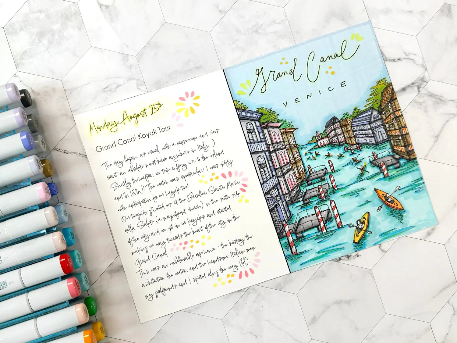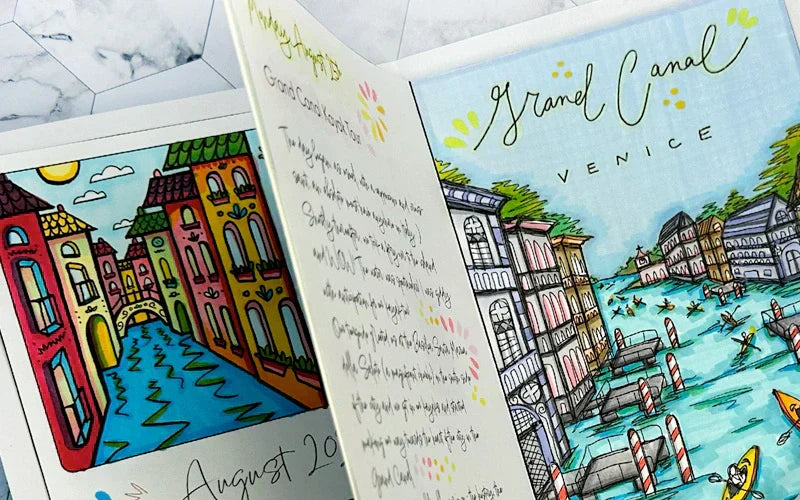

Ciao Copic readers! In our previous blog, we wrapped up coloring the second design of a weekly travel journal insert using the Sketch Pale Pastels 6pc set and a Sepia 0.3 Multiliner pen. Today, we’ll be showing you how to color a detailed illustration of the Grand Canal from a trip to Venice, Italy using the Sketch Manga Illustrations 24 pc set. And with that, let’s take a look at the template below and get started!
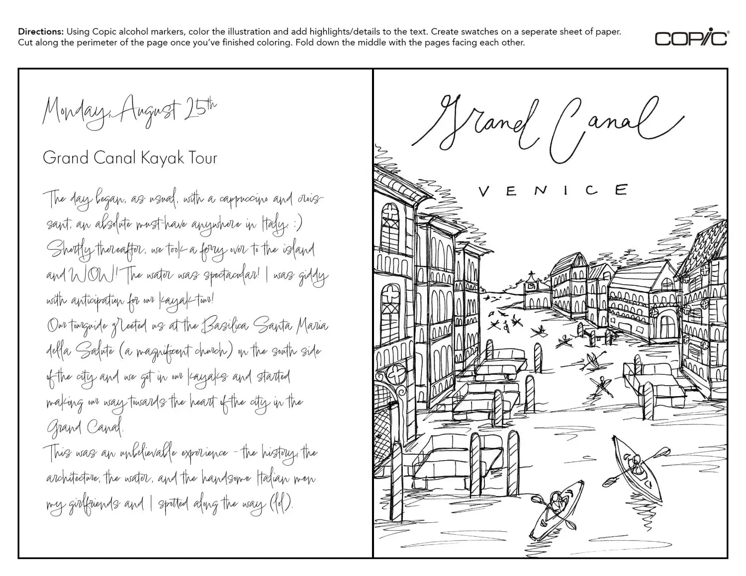
If you've been following along with us in this travel journal blog series, you’ll remember how we sketched two different travel destinations back in August. Both of these drawings were very detailed and required the highest level of skill compared to the other travel journal components we've been making (the covers, weekly inserts, etc.). With that being said, coloring this line art is also going to involve more skill and a larger color palette. The artist in this blog is going to walk you through their coloring approach using the Sketch Manga Illustrations 24 pc set, creating a unique and vibrant illustration to enliven the pen drawing.
To begin coloring, the artist chose to start with the largest areas first, the water and the sky. Starting with BG53, the artist uses the Super Brush nib to “outline” the areas of the water where natural shadows occur, being generous with how much of the color they apply, knowing that it will be blended with a lighter color, BG01, after. The artist uses the side of the Super Brush nib to add BG01 horizontally across the water, creating color strokes that fit the natural “shape” of water (flat/horizontal). Be sure to overlap the lighter BG01 with the darker BG53 color to ensure these inks blend well together!
To add more contrast, the artist uses a darker blue, B04, to go over all of the shadow areas initially colored with BG53. This makes the water stand out more with increased depth. Another layer of BG53 is added again using the side of the Super Brush nib to create an expressive, streaky marker look over the areas where the water ripples are.

Next, the artist uses B41 (Powder Blue) to color the sky. Using the Super Brush nib to outline the entire area first, the artist adds color vertically from left to right, then uses BV20 and BG01 to add extra contrast to the perimeter of the sky. Finally, the artist uses another layer of B41 to enrich the value of the sky, but this time, adds the color horizontally to mimic the horizontal waves of the water beneath.
Now that the water and sky have been colored, it’s time to add color to the rest of the scene! Beginning with colors that are most obvious (for example, using G03 and combining BG01+Y18 to create another shade of green for the tall trees in the background), the artist slowly works from the back to the front of the scene, using combinations of the 24 colors in the set that feel most natural.
Using combinations like E84 + YR01, the artist chooses three structures evenly spaced throughout the drawing to add these colors (one building on the left and two on the right side of the canal). The artist also uses colors like N2 for the floating docks and R17 for the “candycane” water buoys, as well as the bright YR15 and Y18 for the kayaks (which easily stand out against the blue-green water).
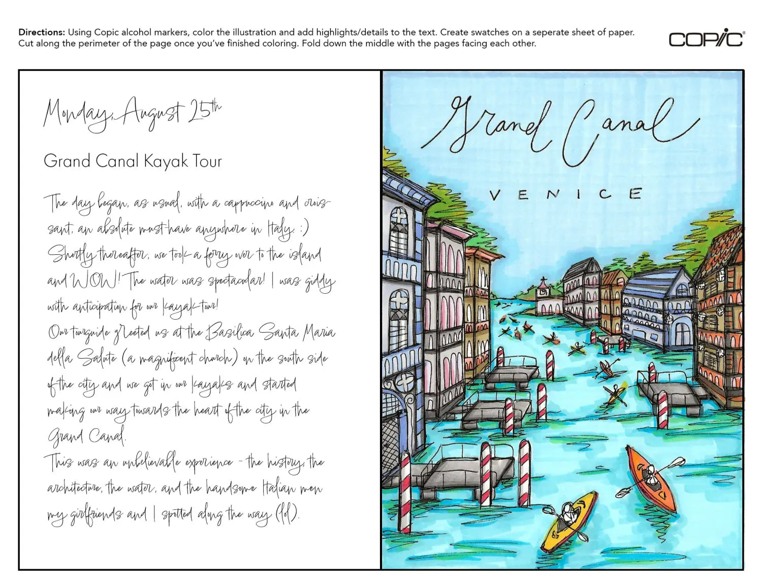
To finish coloring the rest of the scene, the artist uses another color combination, BV20+BV13+B63+N4, for two more buildings, spacing them throughout the composition as well. Another unconventional color combination used for the architecture is N2+N4+N6+RV52+R43. Once more than half of the buildings have been colored, the artist goes back and forth with this 24 pc palette and adds touches of color to areas that need more contrast (by adding a darker color) or that need more vibrancy (by adding a more saturated color). By doing this, the artist adds a painterly touch to the drawing.
The final coloring step for this spread is to add highlights and details to the text. This helps to unite the drawing with the journal entry and makes it look more cohesive. To add dots and petal shapes, the artist used either the side of the Super Brush nib (for the petals, by laying the nib nearly flat on its side), or the point of the Super Brush nib (for the dots, by holding the marker straight and lightly dabbing the page).

Using bright, warm colors, the writing stands out in contrast against the primarily blue/cool illustration to the right. An easy unifying feature, yellow (Y000 and Y04) is added to the top of both pages. This draws the eye upward and allows the reader to easily identify the date and location of this trip. This is especially helpful when you have multiple pages assembled in one travel journal!
Now that our spread has been colored and cut, it’s time to add it to one of our on-going journals! Begin by folding the spread “hamburger style” down the middle. This is a fun way to see how many layers of ink you used while coloring by seeing the back of the page! Next, grab a colored travel journal cover and weekly insert (the artist used the Venetian cover with the horizontal weekly spread) and add this featured destination of the Grand Canal to the back of the journal.
Notice how the pages don’t fit exactly flush with the border of the cover. This issue will be addressed in a future blog where we will show how to “bind”/assemble all of the interior pages to the cover.
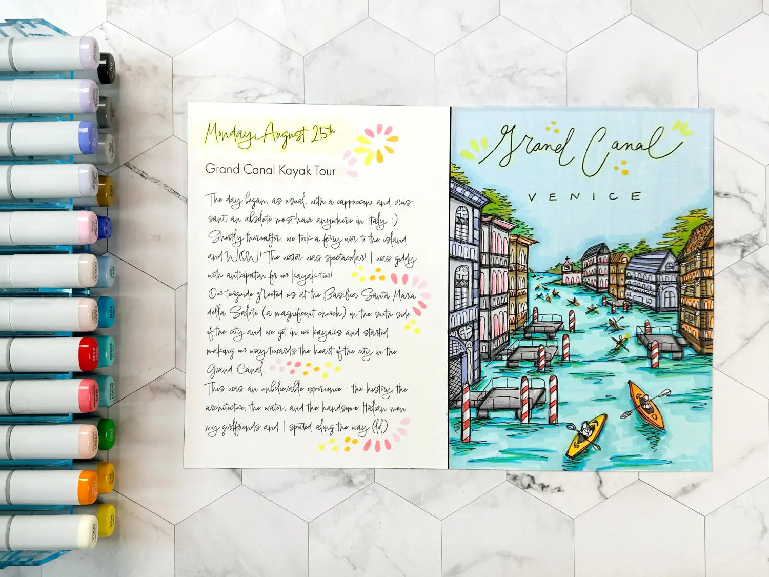
And with that, we wrap up today’s blog! To give this lesson a try yourself, download the below template here from our line art gallery and print it on a sheet of smooth cardstock suitable for Copic alcohol markers. If you’re wondering what kind of paper works well with a home printer and can also handle multiple layers of coloring with Copic markers, we recommend using Neenah Bright White Premium Cardstock 65 lb. paper, which the artist used in this blog. Then, using the Sketch Manga Illustrations 24 pc set (or any other set of your liking), color the Grand Canal spread and experiment with bold color combinations!
In our next blog, we’ll be coloring another Italian travel destination, the Ponte di Rialto, using the same color palette seen in this blog (the versatile Sketch Manga Illustrations 24 pc set). Until then, don’t forget to follow us across our social media channels @copic_official_us, and sign up for exclusive discounts and prizes by joining the Copic Club! One last thing - use #copicwithus or tag us @copic_official_us for a chance to have your drawings or workspace featured on our Copic US social media channels.
Thank you so much for reading and enjoying Copic markers as much as we do! 😀