Nature Series: How to color a stylized, folk-art inspired forest
Today’s Feature:
Coloring a seasonal forest illustration:
FALL palette

Hello Copic readers! In our previous blog, we showed you how you can color a forest illustration by using a winter-themed palette, choosing from two different Copic Sketch 6 piece sets. In today’s blog, we’ll be applying those lessons by showing you how to color a forest illustration using a fall-themed palette!
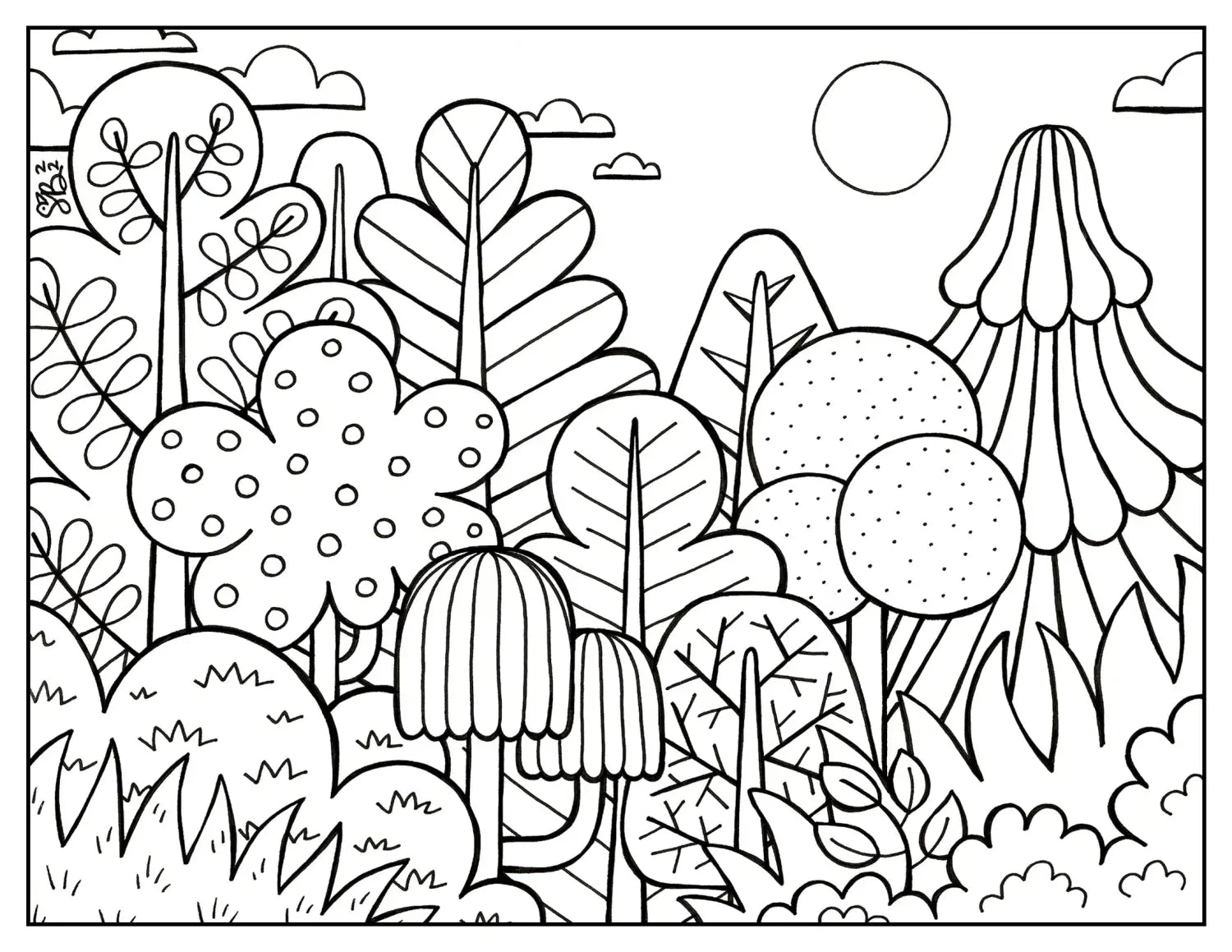
Before we begin, the materials you’ll need in order to follow along with this blog include the above 8.5 x 11 inch line art printed on BOTH a standard sheet of printer paper (for note-taking) AND a sheet of cardstock paper, as well as the Copic Sketch 6 piece Portrait tones and Earth Essentials sets (or whatever brown, blue, and green markers you have). And with that, let’s grab our materials and get started! ✍️
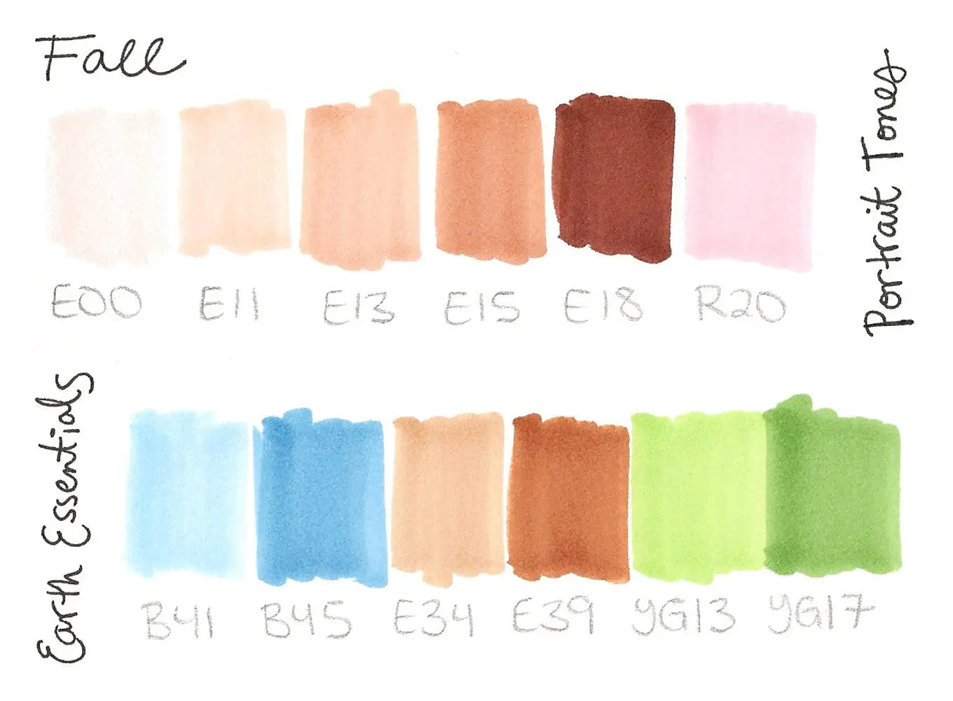
The first thing we’ll do before coloring in the forest is swatch out our marker colors (if you haven’t already). We recommend swatching out your colors first using the Super Brush nib, since this is the nib you’ll most likely be more familiar with and use throughout the coloring process. Swatching your colors may seem like a mundane and meaningless task, but it helps you know what the colors will look like on your paper before applying them to your drawing, especially since marker colors may look darker on a thinner sheet of paper versus a thicker sheet (or a pure white sheet vs. an off-white one).
One last thing swatching is good for: to see if any of your markers are dried out! If you do have dry markers, now would be the perfect time to refill them with the corresponding Copic Ink color!
*to shop for Copic Ink, please buy from one of our authorized retailers, find a store near your location using our store locator.
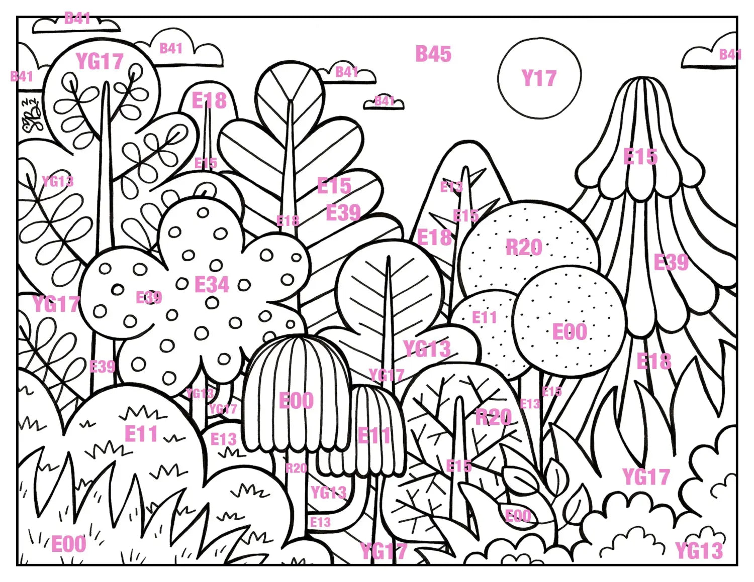
Now that our fall palette has been swatched, grab the printed line art on the standard sheet of printer paper and start adding in the Copic color codes in each plant shape. I like to call this step creating a value plan, since this is a quick and easy way to figure out how you’ll color the composition, while also making sure that you don’t have a lot of the same colors across multiple shapes. Plus, this planning can all be done without using any of your valuable marker ink!
Notice too how many of the numbers in the front/foreground end with 0, 1, or 3, and they increase as you move further back into the forest. This is due to the fact that objects in the foreground are closer to you, and thus lighter than those further out in the distance. By making notes (and possibly erasing some to make rearrangements) on this value plan, it’ll be easier for you to determine which colors should go where! This leads us to our next step, which is…
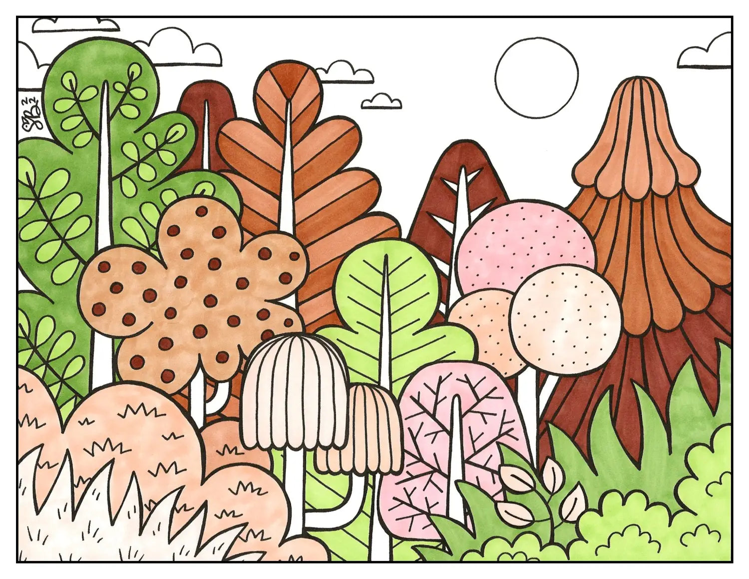
…adding your first layer of color to the forest plants! Starting with just these large shapes is a personal preference, as sometimes the notes I take on a value plan end up changing slightly throughout the coloring process. However, now that a good amount of the composition has seen its first layer of color, I can fill in the tree trunks accordingly and make any adjustments.
*Coloring tip: In the scan above, I colored each shape by using the Copic Sketch Super Brush nib, coloring either in small circular motions or up-and-down, depending on the shape of the object/plant. I like to color in the direction of which the shape is going; for example, in the circular tree, I colored quickly in a circular, scribble motion. The same technique was applied to the bushes along the left and right sides of the foreground. However, for the shapes that showed a linear direction, like the light brown, dome-shaped tree in the front and the brown evergreen tree in the back, I colored in long lines, moving my marker nib up and down across each shape until it was completely filled in. Give both of these coloring techniques a try and find what’s most comfortable for you!
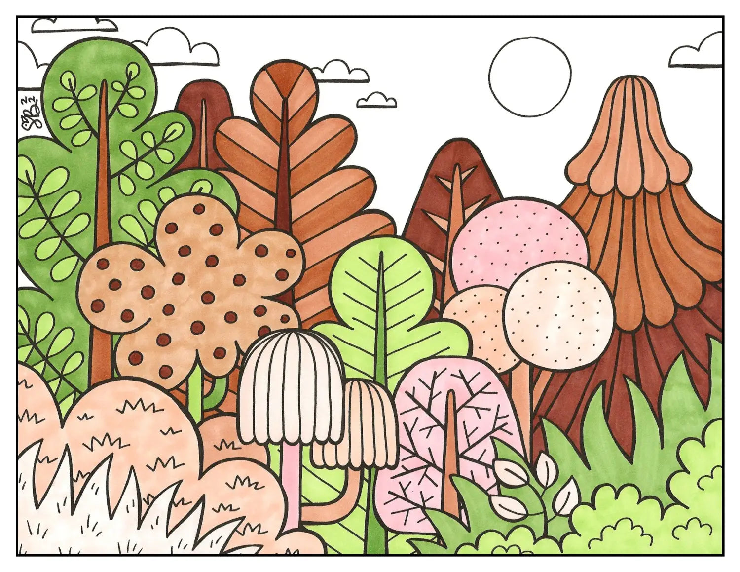
Now that we’ve colored our large tree shapes, the next step is to fill in the tree trunks! If there’s something you want to change from your original notes, now’s the time to make them; otherwise, follow along with your value plan. By working step-by-step, filling in one area at a time, the once daunting task of figuring out how to color becomes much less stressful!
*Note: since these tree trunks are all vertical, I colored all of them in an up-and-down direction.
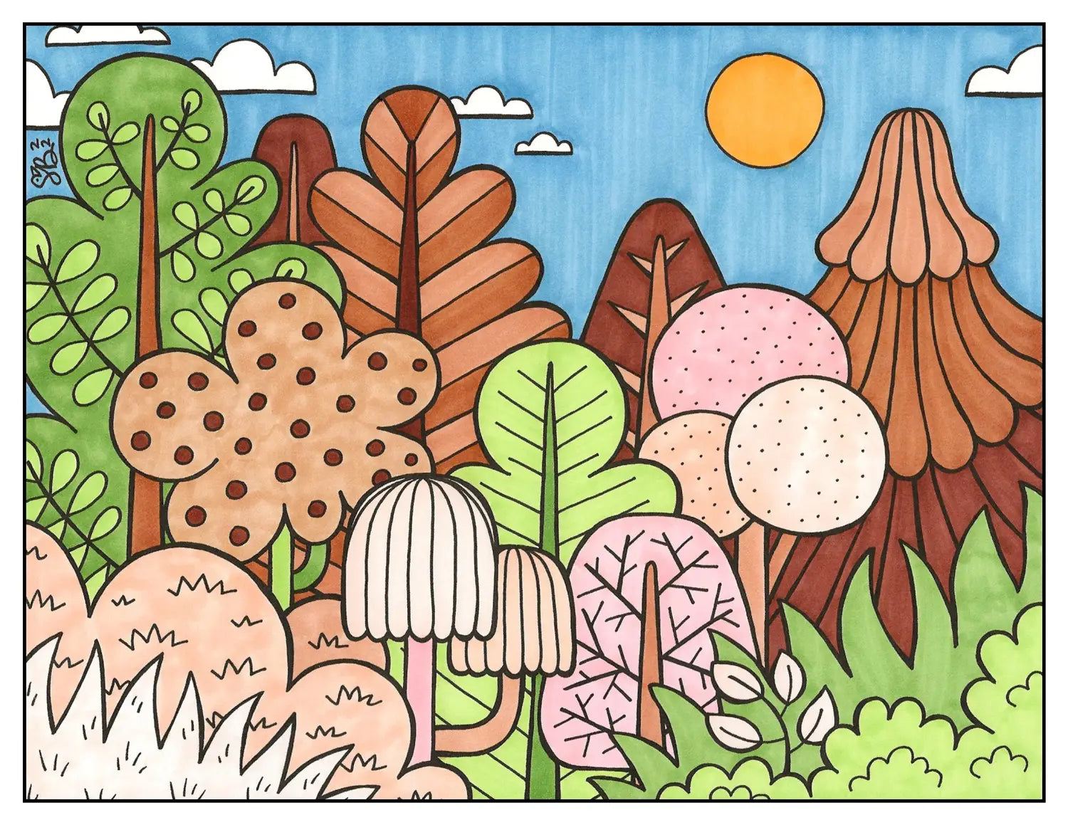
The next step after filling in the tree trunks is to color the elements in the sky! Since I want this forest to be set during the evening, I chose to color the sun with a darker yellow, Y17 (which is a color outside of the two sets I’m using to color this fall forest). I used the mid-tone blue color, B45, in the Earth Essentials set to color the sky, and left the clouds empty (for now) with the white of the paper.
*Tips on coloring the sky/a large blank space: The first time you apply a marker to the page, there will be some streaks left behind (especially in larger areas and with darker colors). So, for this particular piece, I decided to color the first layer of the sky in an up-and-down motion, knowing that I’ll be coloring the second layer left to right, creating a slightly checkered but evenly colored sky behind.
However, if you don’t like the look of slight marker streaks, then add your first layer of the B45 sky with small, quick scribbles, and do the same for the second layer.
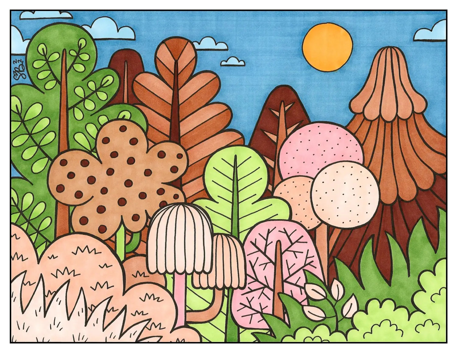
Now that everything has seen one layer of color, let’s go over everything again with another layer! You don’t have to go over everything again, but by doing this, you’ll soften the marker streaks that are visible from the first time you applied the color. Plus, you’ll darken and enrich the composition, making it look more complete!
*Note: After a second layer of color was added everywhere, the white clouds stood out more than I wanted them to, so I colored all of them with B41 (the light blue in the Earth Essentials set).
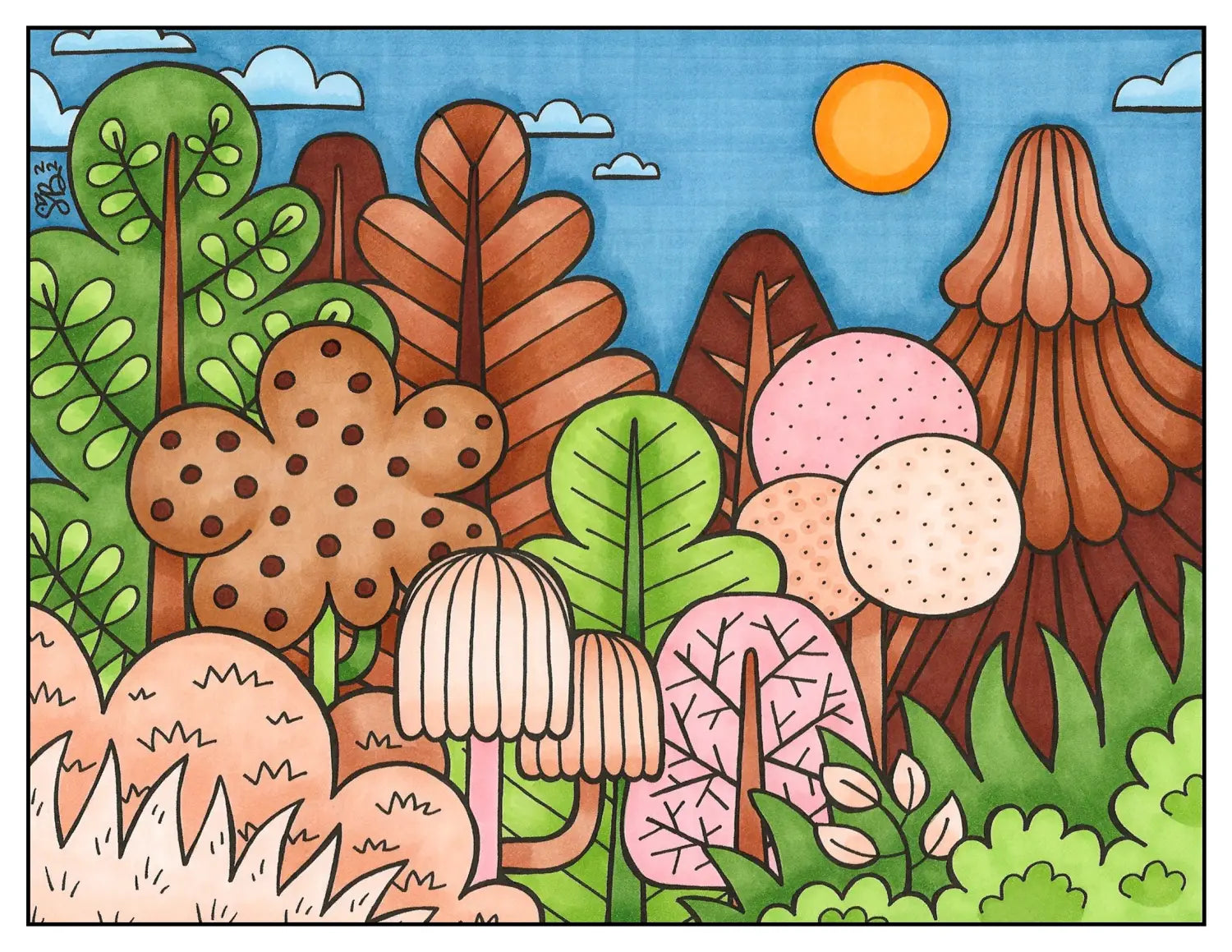
The final step, after you’ve waited for the second layer of color to dry, is to use the flicking technique with the Super Brush nib to add depth to areas where there would be a shadow. For example, where one part of the forest overlaps with another, like the bushes on either side of the foreground, where extra flicks of E11 or YG17 were added where the E00 and YG13 bushes overlap with each other. Just by adding these extra flicks of color to each tree, bush, cloud, sky, and the sun, the composition really pops out and creates a stunning amount of contrast!

Now that we’ve wrapped up today’s blog, let’s see how YOU apply these tips and techniques! Print the above template here on an 8.5 x 11 sheet of regular printer paper and a thicker cardstock paper (one that’s suitable for alcohol-based markers). Once you’ve colored your own version, share it with us on social media using the hashtag #CopicWithUs, or tag us @CopicOfficialUS on any social media platform! We can’t wait to see what you create!

That's a wrap on today’s blog! 😊Stay tuned for our next one, where we’ll be continuing this series by showing you how to color the forest using a SPRING-time color palette!
